Winter is for black and white

_DSC5755.jpg

This black and white project in January shall educate my eyes. I’m looking for contrast. A good black and white pictures must have black and white parts. There are surely also pictures that are mainly grey, but this doesn’t convince me. In the above picture are black stems. The lake is white and clear. Winter is a color reduced month. To find black and white is easier than in summer time.

Things to look for on my photowalk today:

  1. Deep black and clear white.

  2. Every picture needs a subject matter.

  3. Light and shadows are most important. Always.

Time to get out for a walk.

January shall be my black and white month

_DSC5731-Bearbeitet.jpg

In January I’ll focus on black and white images. January is a perfect month for this project, because colors in nature are reduced during winter time. The stems of the trees are dark brown, almost black. There are no leaves who could hide the dark skeleton. Snow is white. Many days are simply grey. People dress in dark colors.

When color as a medium to tell something is missing, one must focus on composition and contrast. Exactly this is my intention for the next months. I’m going to explore composition. There are a lot of subject matters, I’ll stick to asanas. This topic still excites me.

Does anybody like to join?

Looking for locations

_DSC5773-Bearbeitet.jpg

The best location here is around the lake. Nature is wild there because nobody cares anymore. Trees and bushes, plants and flowers grow towards the sun or towards any direction they like. The sun dyes nature reddish, yellowish and blueish, it depends on the time of the day. Today it was freezing cold. The lake was frozen already. I had forgotten to pack a cap. A scarf had to do the job of the cap. It had to warm especially my ears. Buh, the wind blew cold and strong. It reached even the bones and I swore by myself to put on warmer clothes tomorrow. By now I like the cold temperature. It wakes me up. I feel heroic, because I left the warm and cosy sofa to get out into the rough nature. The naked hands are protected from the cold in the pockets of the coat. I walk fast to warm up the body, yet the wind and the temperature work against it. One hour only the walk is over. What a joy to sit in a warm living room again.

No way to force myself into a yoga pose at that gorgeous location. It’s too cold for acrobatic activities. Every cell of my body refuses to perform even the easiest asana. At least this was the feeling today. Perhaps I’ll be more adventurous and less cautious tomorrow. I’m prepared now and know what to expect.

Have fun

Back mirror

Back mirror

Whenever I read a book on creativity, I read: Have fun. Enjoy the process. I do have fun. The results of editing and blending pictures surprise me. Every tiny step, every tiny manipulation leads to another picture another atmosphere.

For the last creations I took pictures from my archives from the last year. I always think I want to have totally new pictures. Tomorrow I’ll go out with my tripod and my camera. It’s autumn here, yet it’s still not too cold. It’s a bit rainy here, but that’s OK. I’ve already a few location in mind.

At the arches in Utah

At the arches in Utah

At the arches in Utah

Title: At the arches in Utah

The landscape is from Utah, the pink rose leaves are from the Botanic garden in Portland. The sky was captured somewhere in the US. The picture of the model (myself) was taken at home. When I start creating a picture I often have an imagination, but at the end the picture is a surprise.

This above picture reminds me of the romantic painter Caspar Davis Friedrich.

15 minutes can be enough

Dancerspose.jpg

Fifteen minutes can be enough to create something new. This is an experience worth to remember. Sometimes I worked an entire day on a picture and the result didn’t please me. Today’s session was rather experimenting and I wanted to kill the time before dinner.

Congruence and simplicity

Yoga black and white.jpg
Self-portraits.jpg
 

Yesterday I went through my two websites. They are the roofs of all my online activities. It’s important that I like them. When I neglect them, how can I expect to have visitors there. A website is supposed to be inviting. I have a website for my yoga activities and a website for photography, which is this one.

Websites grow slowly. It’s very likely that one changes taste and insights. Yet all the pages on a website shall form a unity. One must have the impression that all the contents belong together.

My steps to a more congruent presentation:

  1. I have now the same templates for both websites. Squarespace offers the templates and I’m very happy with this company. The websites are easy to use and they offer many useful tutorials.

  2. I removed (almost) all the pictures that have nothing to do with my current focus: Yoga as a body art form. To let go is always a difficult task.

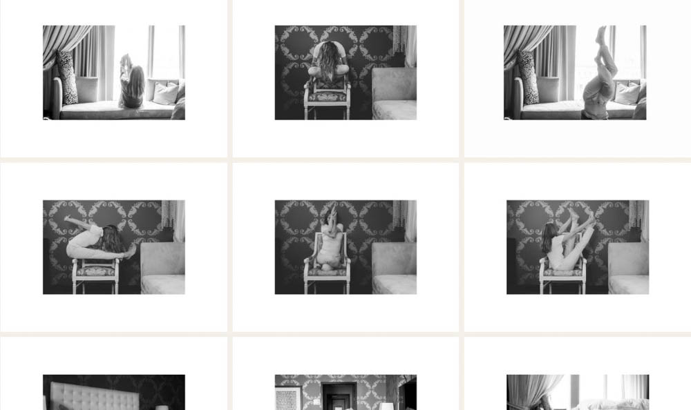
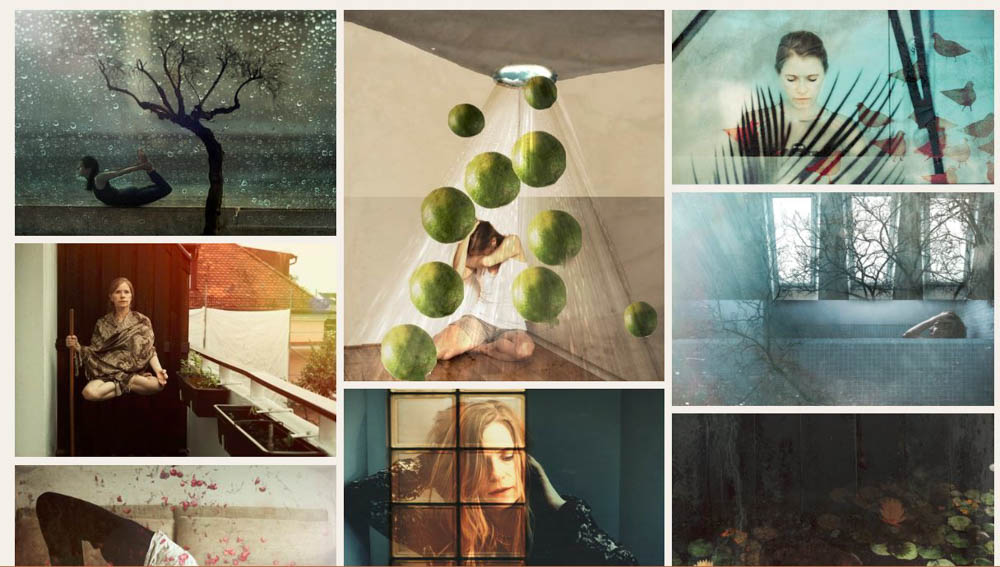
  3. The presentation of the pictures shall be congruent, too. If there is a frame around a picture, then all pictures shall have this frame in this gallery. It’s possible to zoom in up to 500 %. This should be large enough for those who want to see details.

Gallery #1 (first picture) has much more structure than gallery #2 (second picture). The size of the pictures differ a lot. It’s difficult to find the red thread. A frame would hold them together already.

A picture a day...

Yogaonthegrass.jpg

….keeps boredom away.

I like the smell of freshly cut grass. It’s relaxing to sit on a blanket on green grass. In pictures I’m not convinced of this color. In combination with red it’s different. So, I tend to convert pictures with too much green into black and white ones.

Black and white a step further

Shadow2.jpg

Black and white pictures are more intensive if there are not so many grey shades in the picture but true black and white. The shadow in front of me on the sand was rather impressive. I took the pictures by myself without self-timer. With one hand I held the camera. This determined the perspective. It could be interesting to work with a tripod. The pictures look almost abstract.

Three different light situations

  1. In the first picture I took a linen to have a rather even and bright background. I shot with the light. Behind me was a window. The effect is that I’m evenly lighted.

  2. In the second picture I have back light. This is ideal for silhouettes. The body side that faces to the camera is shadowy. It’s possible to make the body brighter. The effect is that the background is almost blown out and very bright. It’s almost exhausting for the eyes to look at the picture. White parts always get attention from the viewer, which can be distracting. I could work with a second light source or a reflector to brighten up the body. Yet the background will remain very white, which I experience as almost aggressive. It’s hard for the eyes. There are no soft transitions from the background to the body. The form is clear though.

  3. The third picture is taken outside on a cloudy day. It would have been perfect if I had been there in the morning or in the evening. When shooting outside one never knows how the weather will be, light and weather are changing permanently. It can be sunny, rainy or cold, so that it can be difficult to perform yoga poses. This park is very nice, I’m not sure if I like the green. In combination with red it’s fine, but the color itself is rather dominating.

Light creates atmosphere in a picture.

For my purposes I prefer to shoot with the light (picture 1). I’d like to show the yoga pose. I think it’s almost a bit ugly if the skin is so shadowy. It can look even a bit dirty. The colors disappear when shooting with back light. To shoot outside is not always possible, but I’ll do this more often, because I like the light. I’ll look for locations that have a roof. A more urban location would please me more, I guess.

Next week I’ll look for backdrops and backgrounds/locations. Living rooms, beds, kitchens are too arbitrarily in a picture with the focus ‘asanas’. It adds a story for sure. But as it’s always the same living room, the same bed, the same kitchen it gets boring rather soon.

My main purpose to take pictures of asanas is to learn. Pictures are a tool to improve.

My second picture is to show the beauty of practicing yoga.

Use what you have

_DSC5970.jpg

Today I walked to the lake that is very close. A lake in the background is always nice, I thought. I had no tripod with me and also no remote control. Only my camera hang over my shoulder. I removed the strap and put the camera on a bench. I used the self-timer in the camera to take some pictures.

Sometimes a camera is enough. It’s not necessary to carry around all the fancy gadgets. It’s nice to have. Yet it’s possible to be creative with much less.

If I put a book under the camera I could have changed the frame. A book or a journal is always in my handbag.

A last attempt to save a picture - rules to judge the own pictures

Din A 4-Bearbeitet.jpg

Playing around is part of the process to create pictures. But one must also know when it’s enough. Sometimes sketches are just this and nothing more. They will never become an awesome picture

This time I turned around the picture to show more lightness. I didn’t like to hang there. Now I fly high. To have the floor on top of the picture looks off.

It’s difficult to hav a critical view on the own pictures. One cannot forget how difficult it was to create it. Often a lot of time is invested. To hang on that bar was exhausting. I feared to fall. I felt like a hero because it was so cold on that day. All this is of zero interest for the viewer.

Rule #1: Forget about the effort and time that was put into the creation of the picture. Only the result counts. The picture is convincing or it is not. The story behind the picture is of second importance.

Rule #2: Wait and day and one night (or even longer) and then get back to the picture. The initial emotions cooled down in the meantime. It’s possible then to have a more neutral view. This requires a lot of discipline at least for me.

Rule #3: Know what the subject is. Know what you wanted to express with this picture. Some pictures might be nice but they don’t show what was intended to show. I’m a huge fan of the written word. It’s good advice to have a journal that documents the journey to an eye-catching picture.

Rule #4: Have a list of criteria that makes a good picture for you. Such a list could be:

  • Is it technically as wished?

  • Do the colors communicate the intended atmosphere?

  • How is the composition? Are there leading lines? Which rules are applied? If not, why?

  • If people are involved, I always check the expression of the face and the skin.

This list can be much longer. More important than a long list is to apply it. Wink, wink.

I won’t print this last version. Soon it will be buried and sleep between other pictures that live better in the dark.