
Yesterday I went through my two websites. They are the roofs of all my online activities. It’s important that I like them. When I neglect them, how can I expect to have visitors there. A website is supposed to be inviting. I have a website for my yoga activities and a website for photography, which is this one.
Websites grow slowly. It’s very likely that one changes taste and insights. Yet all the pages on a website shall form a unity. One must have the impression that all the contents belong together.
My steps to a more congruent presentation:
I have now the same templates for both websites. Squarespace offers the templates and I’m very happy with this company. The websites are easy to use and they offer many useful tutorials.
I removed (almost) all the pictures that have nothing to do with my current focus: Yoga as a body art form. To let go is always a difficult task.
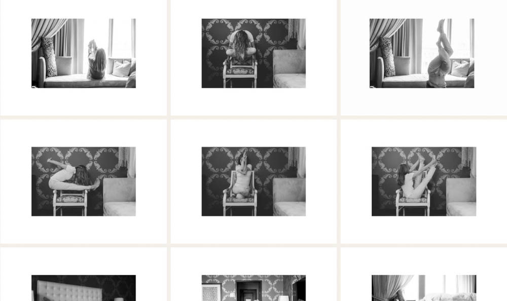
The presentation of the pictures shall be congruent, too. If there is a frame around a picture, then all pictures shall have this frame in this gallery. It’s possible to zoom in up to 500 %. This should be large enough for those who want to see details.
Gallery #1 (first picture) has much more structure than gallery #2 (second picture). The size of the pictures differ a lot. It’s difficult to find the red thread. A frame would hold them together already.