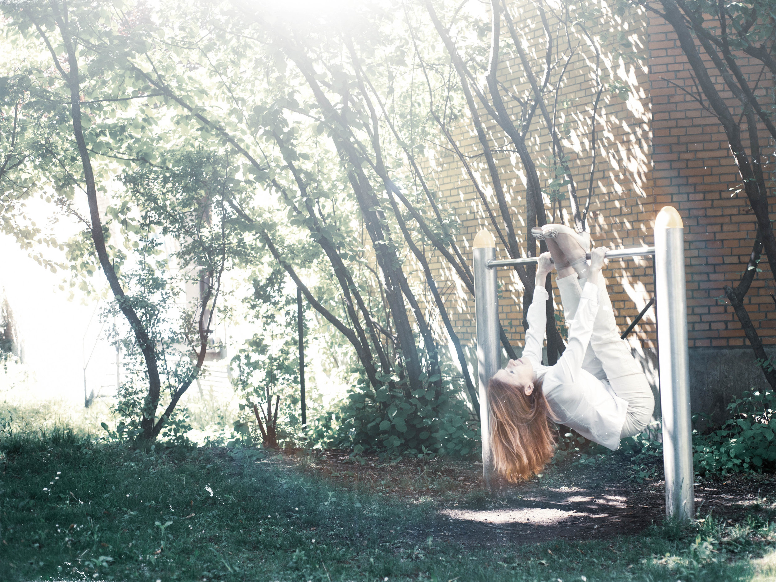
I started a new series. It should be about levitation. Very soon I interpreted the topic much broader. I wanted to show lightness in yoga.
Sketch 1:
A picture is finished when it’s printed. To find a good print company can be a challenge on its own. The first decision that I had to make was about the size of the picture. This is in my opinion the first step, especially if a picture shall become part of a series. If a picture shall get framed and this is usually the case there must be a rim around the picture. I decided to go for Din A3. The picture itself shall have a size of 20 x 30 cm. I adjusted the picture in Photoshop. First I created a new canvas with the size Din A3. Then I adjusted the picture to the size 20 x 30 cm. Then I moved the picture over the canvas and centered it.
The printed version of the sketch 1 made me realize that the filter that I had used made my face look like dead. The skin of the face shall never look bluish, yellowish or reddish. I knew I had to edit the picture again.
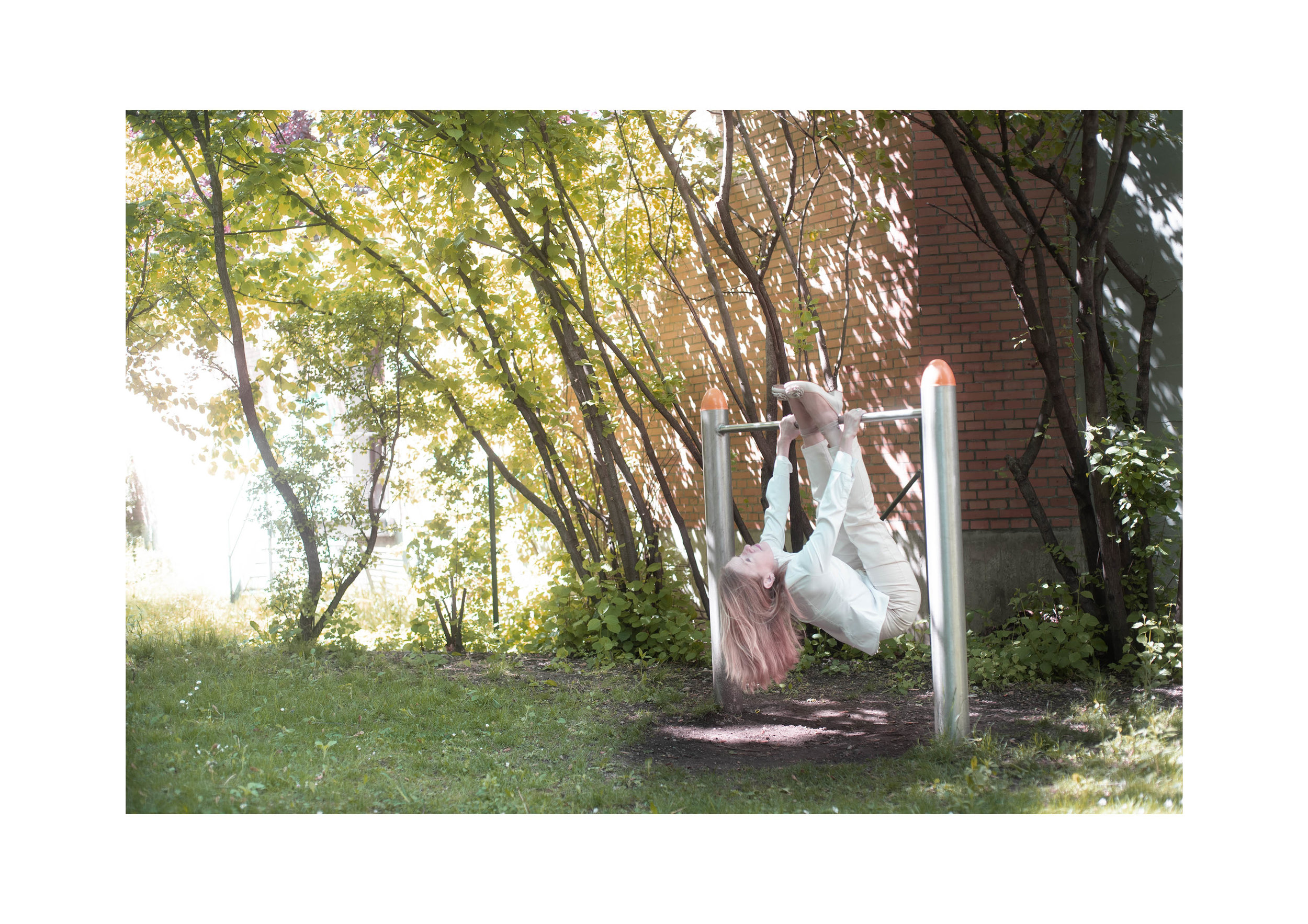
Sketch 2:
The outer frame is now Din A3. I cannot make out why the picture has not my wished size of 20 x 30 cm, but it was so. I had to resize it and get it printed again
I realized that my face was mini-blurred. Blurred is blurred. I had to reshoot my vision, only because of this mini blur. The wall in the background was in focus. Sometime it’s difficult to realize these shortcomings of a picture, because then it becomes clear that one has to repeat the entire process. The next day the weather had changed. There was no sunshine anymore, it was a grey day, which made the location even darker.
It was such a challenge to do the exercises there. To hold my body was hard. I was not strong enough hold the pose for a long time. Soon my muscles got very tired. I couldn’t turn around the bar. This can be seen. I hang there. The pose has no lightness.
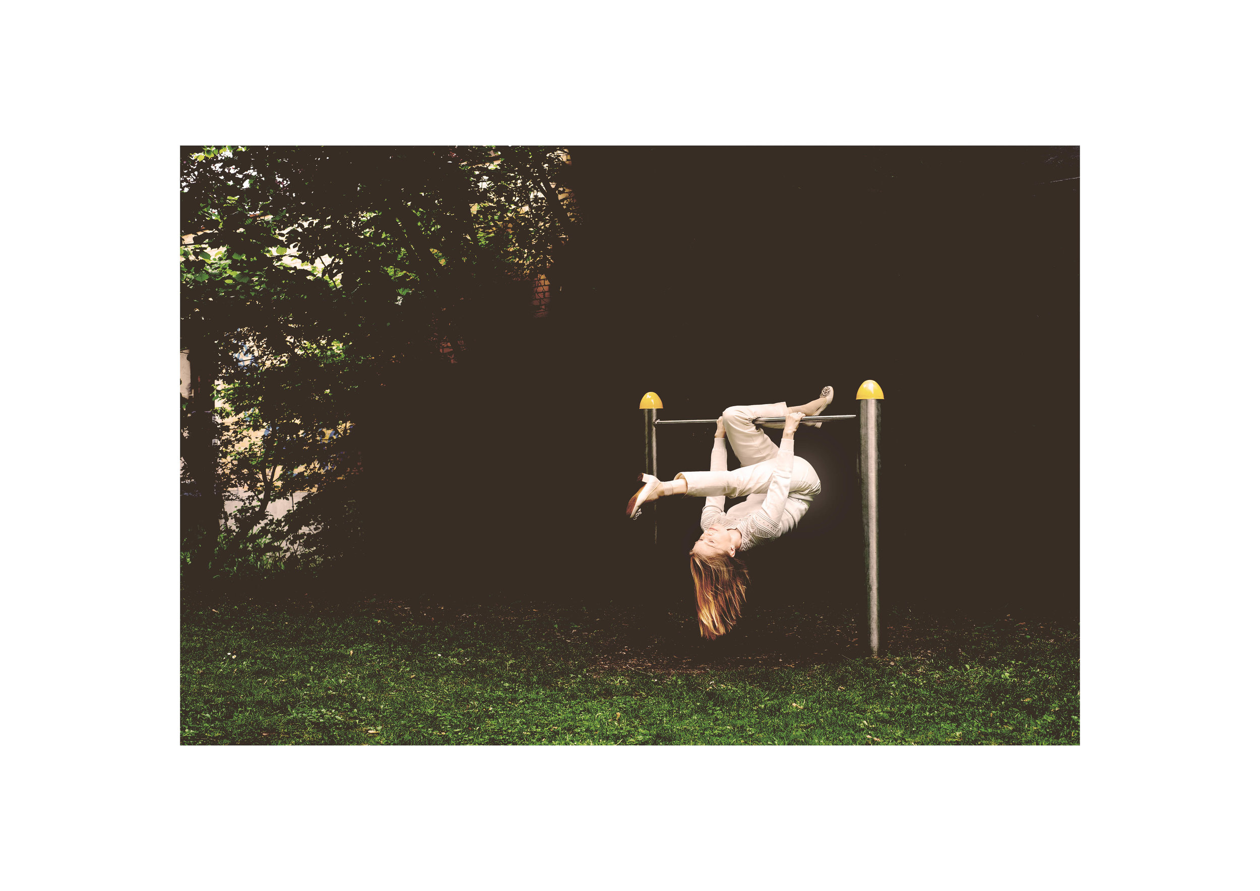
Sketch 3:
The format of the frame and the picture is as I wanted it.
The face is in focus.
The form of the body has more dynamic and looks for me at least a tiny bit lighter.
Nevertheless the picture in sum became too dark. Darkness is the opposite of lightness. My intention was to show exactly this: lightness.
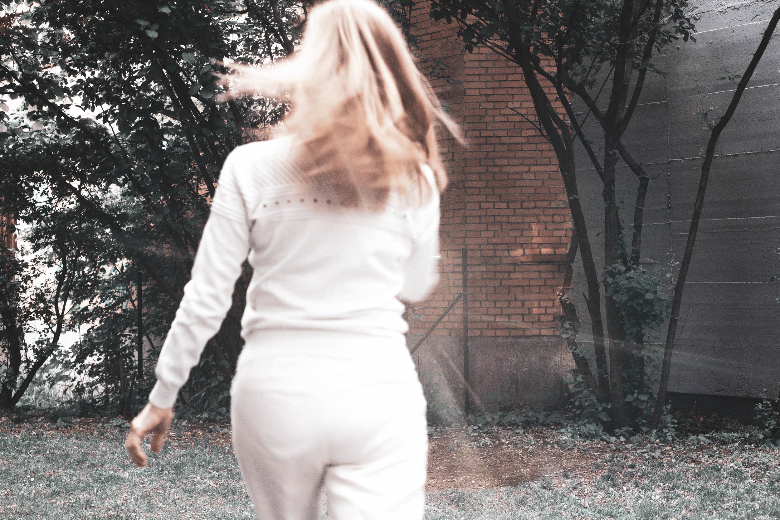
Sketch 4:
I consider to leave these sketches behind me. They were a good exercise, but nothing more.
Summary:
Decide on the format.
Print the pictures.
Filters must be used very carefully when people are in the picture. Skin looks best when natural.
Check what’s in focus and what’s not.
What was the intention to create this picture? Is this intention translated visually in an appropriate way?
Yesterday it rained. Today it’s raining, too. It’s impossible to get to this location again. I call these shootings a warm-up. The corner is a bit too dark. I’m not trained enough to show lightness on that bar. I’ll move on to the next photographic adventure. Sometimes this is the best decision.